01 Main image
Make the offer
instantly clear.
Karviva
A scattered bottle lineup becomes a cohesive juice-cleanse bundle. Grouping the range around one clear message makes the offer easier to understand at a glance.
We're a strategy-led Amazon creative team. See how research and strategy turned ordinary listings into images shoppers click, understand and buy.
300+brands
500+listings
Main images · Image stacks · Premium A+
A few of the brands we’ve worked with







Every project starts with research, not a template. Main images that win the click. Image stacks that answer shoppers' questions. A+ content that brings the brand to life.
Karviva
A scattered bottle lineup becomes a cohesive juice-cleanse bundle. Grouping the range around one clear message makes the offer easier to understand at a glance.
Kitch-a-ma-jigs
The redesign brings the three-piece set, packaging, and food-storage use together in one image. Fresh produce adds context and makes the different sizes easy to understand.
Madelaine · Christmas chocolates
Seasonal packaging and a generous chocolate arrangement make the gift appeal immediate. A prominent piece count helps shoppers understand what they’re getting.
Palette · Tablecloth
A styled place setting brings the tablecloth into a real dining context. The packaging keeps size and color visible alongside the finished look.
SockitBox · Outdoor electrical box
Opening the box reveals how the cables fit inside, while the outdoor setting gives the product an immediate use context. The composition makes its purpose easier to grasp.
Madelaine · Turkey chocolates
Turkey-shaped chocolates and seasonal packaging make the occasion recognizable at a glance. An unwrapped piece adds a clear view of the chocolate itself.
Willowly · TENS machine
A larger device view brings the screen and controls forward. Arranging the accessories with the packaging helps shoppers see the kit as one complete offer.
Alva
A consistent cream-and-black visual system gives each slide one clear job. Cooking scenes, prominent benefit headlines, and comparison content connect the technical details to everyday use.
Kaizen
Warm kitchen scenes pair practical benefits with a more aspirational setting. Each image answers a specific question about fit, capacity, durability, or cleaning without competing blocks of copy.
Willowly · TENS machine
A consistent palette and focused headlines give the image sequence a clear rhythm. Everyday scenarios help shoppers connect the device’s features to how they would use it.
Disposable underpads
The sequence expands beyond packaging to explain size, absorbency, and use. Clear visual demonstrations make practical details easier to compare.
Fruit bars
Fruit-led color and ingredient imagery bring appetite appeal into the story. Nutrition details and on-the-go scenes balance the sensory appeal with practical reasons to choose.
Opteel · Hand sanitizer wipes
A clean visual system connects product details with familiar daily situations. Simple use cues help shoppers picture the wipes in their own routine.
Kaizen
A dark, cohesive kitchen setting turns a text-heavy page into a focused brand experience. The sequence moves from lifestyle appeal to construction details and product comparison.
Diabetic crew socks
Lifestyle imagery introduces the comfort story, followed by focused fit and construction details. A size guide gives shoppers a practical next step in choosing their pair.
Opteel · Hand sanitizer wipes
A cohesive aqua palette connects the product story from introduction to everyday use. Clear sections make the page easier to follow while keeping the wipes recognizable throughout.
Willowly · TENS machine
A more cohesive page connects the device, its modes, and everyday settings. Step-by-step guidance helps shoppers understand the experience before they buy.
Heavy-duty tarp
A bold opening gives the tarp a stronger presence, then close-ups explain its construction. Outdoor applications give those details a clear, practical context.
Good creative isn't a guess. Every image we make starts with what your shoppers and competitors are telling us.
We study your market before we design anything: keyword research, competitor research and your brand's positioning. We find what shoppers are searching for, what competitors already say, and where your product can stand out.
We turn the research into a plan to win the click and the conversion: what the main image needs to communicate at thumbnail size, what questions each image in the stack must answer, and how the A+ content tells the brand story.
Our design team executes the strategy, then every deliverable goes through an internal quality check against the brief and Amazon's requirements before it reaches you.
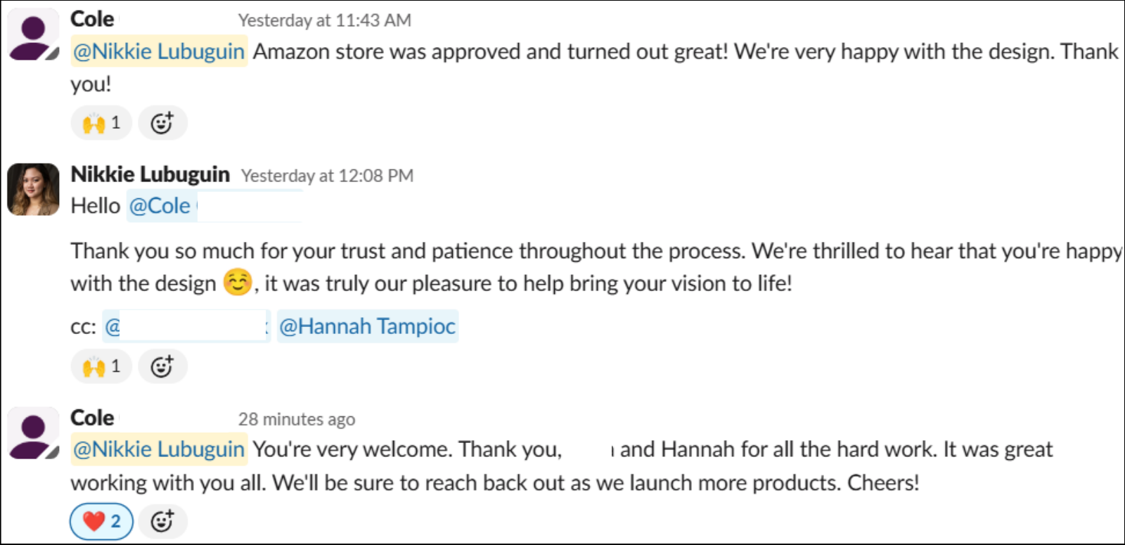
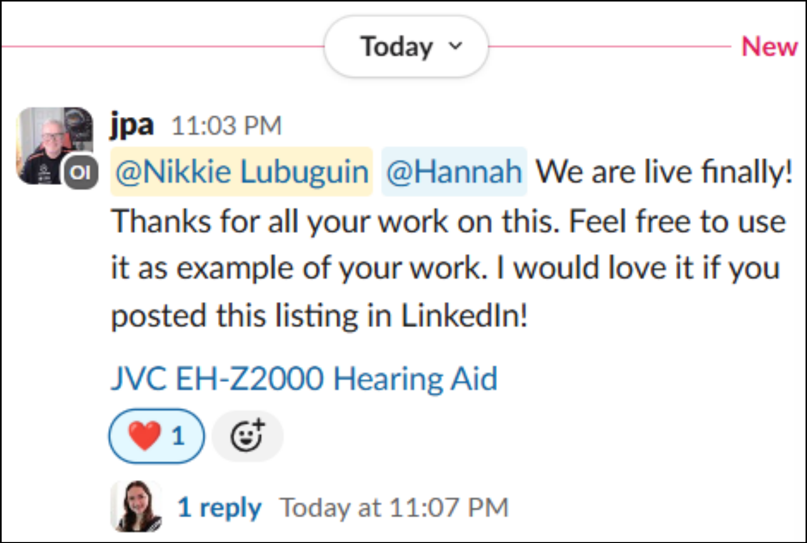
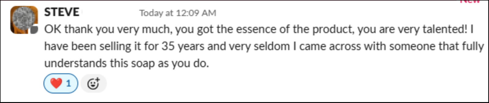
[Mad Cat] Creative has completed several projects for me and I couldn't be happier with the results. With Hannah's creative our CTR and CVR has improved dramatically.
I have never seen an Amazon graphic design agency operate at their level. The CTR and CVR of our listing have increased, along with our storefront sales. They have it all - strategy, speed, quality, and care.

We have noticed a steady improvement in conversion rates since updating the listing images. I appreciate your thorough approach to developing strategies by working closely with clients.

The sales are trending in the right direction with the changes!
Bring your ASIN. On a call with Hannah, founder of Mad Cat Creatives, you'll get an honest look at what your listing creative is doing for you, and what it isn't.
30 minutes. No obligation.